Smooth, simple and modern. Those three words is how i would describe the current MasterCard logo. Given MasterCard is the official sponsor of the 2018 Australian Open you will and have been seeing the new logo all over Melbourne and soon to be your TV’s.

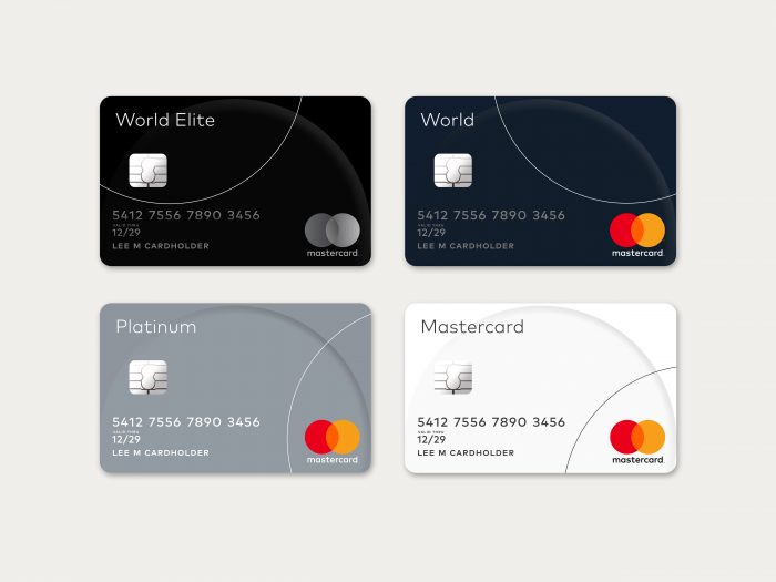
The logo is incredibly simple. Not including the black font it is just 3 colours, simple circles overlapping and centered clean font stating “mastercard”.
MasterCard is up there with the most recognisable logo in the world and this new logo doesn’t stray far from the old one:

But the old ones shows its age, its been used since 1996, no wonder…..
The new MasterCard logo suits the digital age very well, the MasterCard app would look a touch of class with a logo as fluid as this. Just check out these branding pieces to really see the elegance


They really have done it right and done well with the branding upgrade, The simple minimal approach has worked wonders and hasn’t taken away the history of the logo. Well done MasterCard.